Finagling photons for a generative blueprint
I’ve been wanting to try my hands at cyanotypes for years, at least since I read Frederik Vanhoutte’s bittersweet Sun and broken crystal. This summer it finally happened! Here’s a writeup of my experiences, partly to pique your interest, partly as a record for myself.
The kitchen chemistry bit
Cyanotypes are based on two chemicals, ferric ammonium citrate and potassium ferricyanide. Their mixture is photosensitive: UV light triggers a reaction that turns them into a something with a nice, deep Prussian blue color. That’s where the word “blueprint” comes from – cyanotypes were a method of reproducing technical drawings in the past.
Here are the steps for preparing the chemicals. This needs to be done once, and it produces two solutions that you can stockpile for using later, whenever you want to prep some paper for printing.
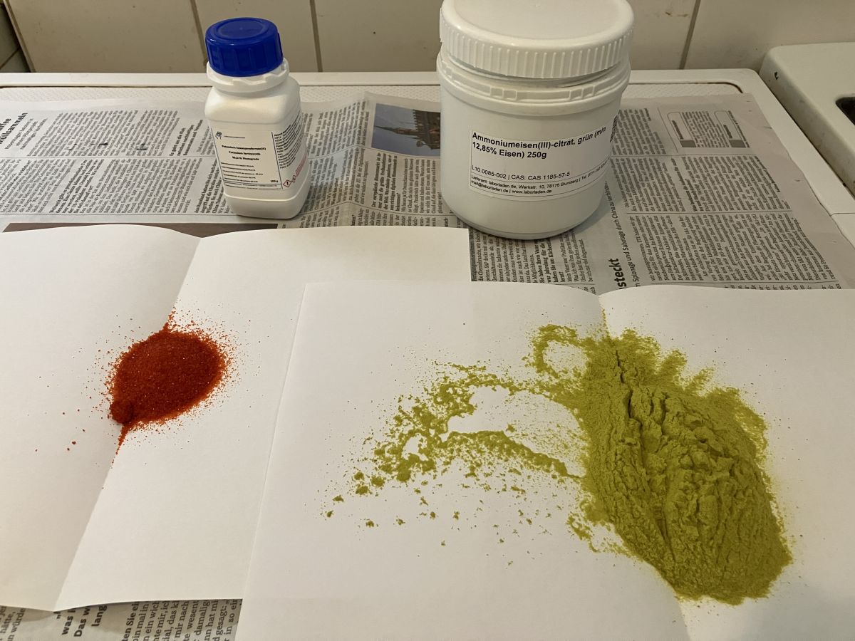
- Both chemicals come in powder form. I find the full names hard to remember, so I simply call ferric ammonium citrate “GREEN” and potassium ferricyanide “RED,” because that’s what the powders look like.
- You make two separate solutions from GREEN and RED. Use 25 gr of GREEN (it’s a relatively large heap) and 10 gr of RED. A regular digital kitchen scale is sufficiently accurate for this. Add enough water to get two solutions of 100 ml each.
- The exact amounts per 100 ml vary depending on what source you’re reading, but it’s a very robust method which works within a broad range of values. I went with 25 gr and 10 gr because the chemicals themselves came in jars of 250 gr and 100 gr, so this way I’ll use them up at the same rate. It’s probably not a coincidence that they are sold in these sizes :)
- I store the two solutions in dark brown glass containers – gotta love the vintage pharmacy aesthetics! The bottles live in my fridge, where it’s dark and cold. But that’s just habit: on their own the solutions are not photosensitive, and they don’t appear to need cold storage either.
Prepping the paper
The evening before making prints I mix equal amounts of the two solutions. Once they are mixed they become photosensitive, so I do this with no sunlight around. I use two syringes to retrieve liquid from the bottles; the syringes are labeled to make sure I don’t cross-contaminate the two solutions. The mixture goes into a small glass bowl, where I mix it thoroughly. This is what it all looks like:
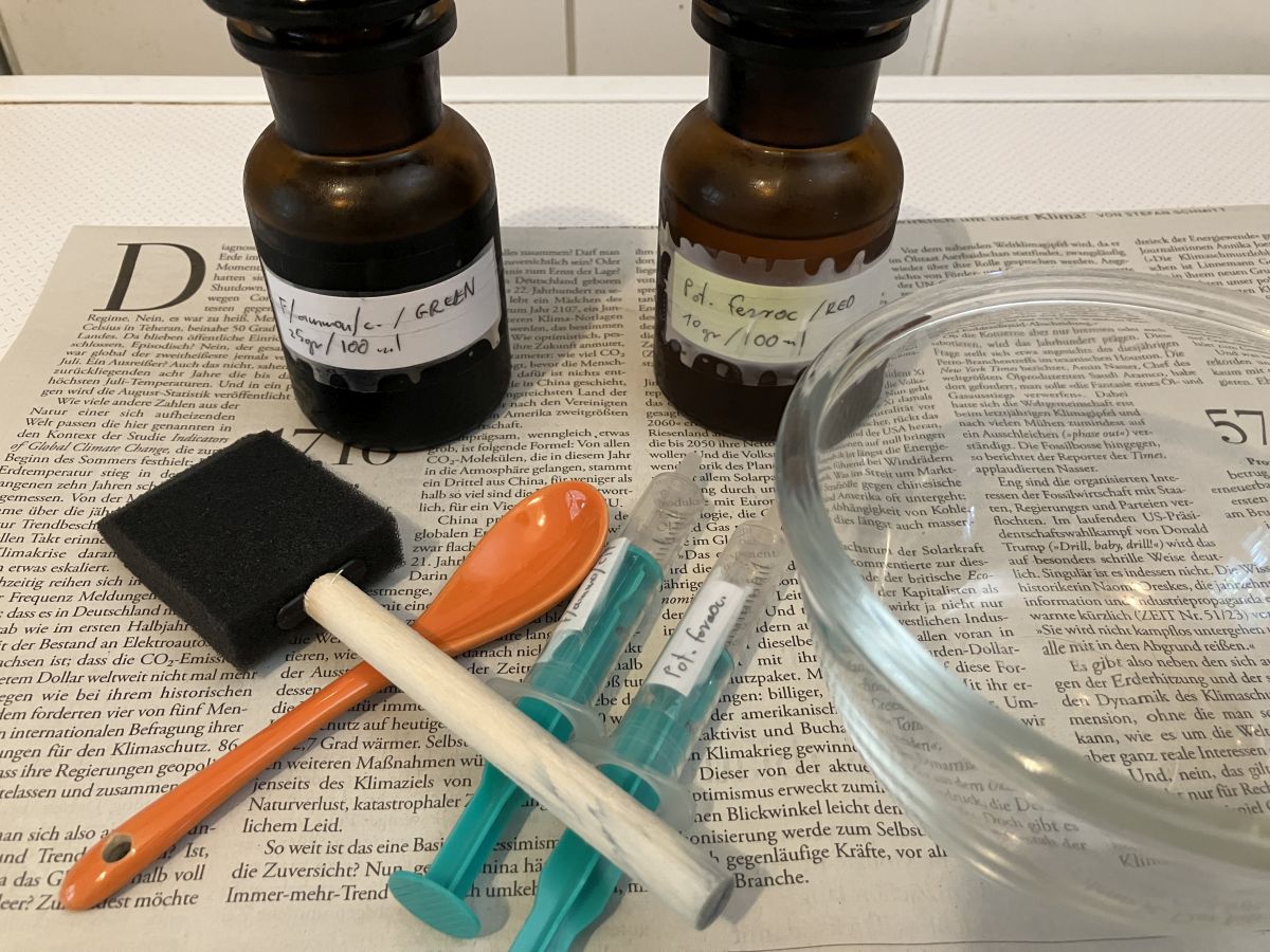
I’m not sure if contact with metals is a problem for these chemicals, but I don’t want to find out the hard way so I’m making sure I only use glass, plastic or ceramic utensils.
Winterbloed suggests mixing the chemicals a day in advance but I haven’t come across this recommendation elsewhere. I just do this when I’m ready to coat the paper for the prints.
For applying the mixture I’m using a plastic foam “brush” or applicator. Several sources recommend this, and it’s worked well for me (though see section later about problems and fixes). I let the sheets dry for an hour or two before wrapping them up in aluminum foil and stashing them away in a black folder.
The following morning is illumination time! In deference to Anna Atkins my first-ever prints were of plants: grass stalks with leaves and spike, and fern leaves. Especially fern leaves!
These two photos show how the color of the prepped paper changes from its initial green to a kind of depressing blueish-grey. I kept my first prints in the direct summer sunlight for 4 to 12 minutes and they all worked out fine. The sweet spot was at around 6 minutes.
Once done illuminating, only one step remains: rinsing the paper. I hold the sheet under gently running water, then let it swim around for a bit in the sink. This washes out the solution that hasn’t activated yet, so there’s no additional photochemical reaction beyond this point. It also magically turns the dull color visible above into a popping blue. I shake off the excess water and hang the sheets to dry.
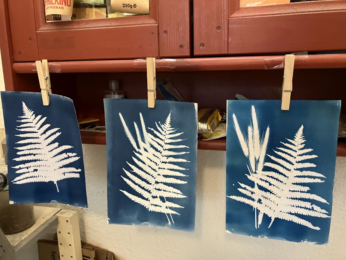
I’ve tried several kinds of paper, starting from a heavier sort of white laser printer paper. I grabbed what I had at home for my pen plotter, and hunted around a bit at an arts supply store. I found that lighter papers don’t absorb enough of the photosensitive mixture, and/or the color gets washed out when rinsing at the end. I ended up with Clairefontaine’s 250 gr/m² mixed-media Paint’ON, either a smoother variant or the rougher “a grain,” whose texture I love in these prints. Heavier papers might work even better.
Prints from pen plotter drawings
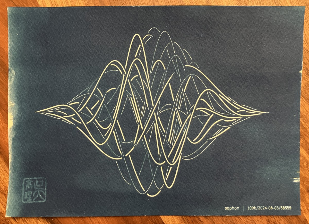
My jam is generative art, and my vision has been to create drawings with code, realize them in a physical medium using a pen plotter, and transfer this image onto a cyanotype. In this, too, I’ve been following in Winterbloed’s footsteps.
The process is quite straightforward: plot the drawing onto tracing paper using a fine, high-quality pen; clamp tightly together with prepped paper in a clip frame; soak in sunlight; rinse in water; enjoy blueprint. The very first time I tried, I lucked straight into a great result!
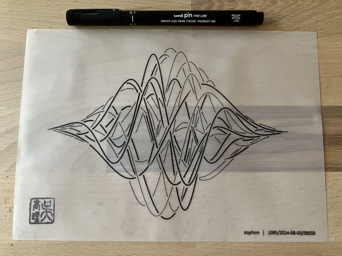
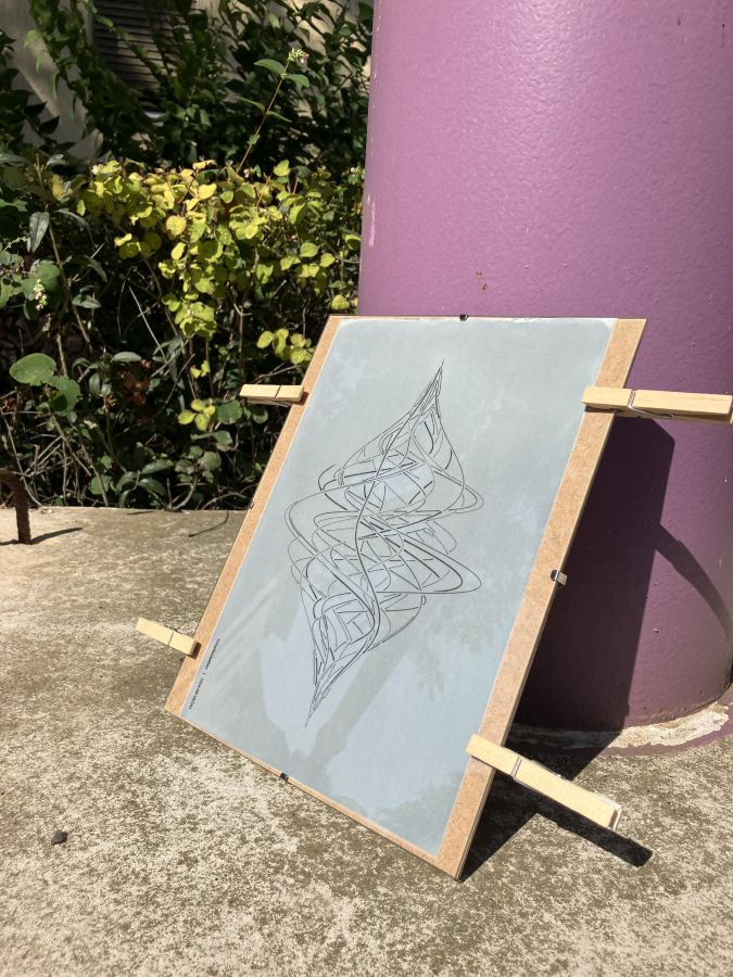
Then I got ambitious and decided to create a series of prints based on this composition. Every time I run the algorithm, it starts from a different random seed and outputs a similar-looking but different set of wavy lines. The idea was to plot several variations, transfer each of them to a blueprint, and exhibit them together as a generative series.
This proved to be remarkably hard! I ended up working on it almost every day for over a week, prepping the mixture and paper in the evenings, illuminating in the mornings, and plotting new templates in between. Some days, cloudy skies added extra delay – but on those days I could replenish the stock of paper that I had used up…
The next section is about all the different things that went wrong, and some fascinating things I discovered along the way.
Trobleshooting
Untreated areas. Most blueprints I’ve seen online have unintentional, brushstroke-shaped areas at the edges that apparently remained dry when brushing on the photosensitive mixture. My initial prints were no exception.
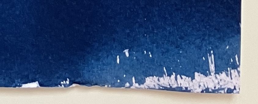
You see the liquid is kind of friends with the paper, but not great friends. The first few times I was very concerned about light, so I worked in near-darkroom conditions where I didn’t really see what I was doing. The edges often remained dry.
Let there be light! So I got adventuresome. Incandescent and LED indoor lights are supposed to be OK because they don’t include the higher parts of the spectrum that drives the reaction. Now I kept the ceiling light on and ended up applying generous amounts of the mixture. The paper didn’t change color while I was working (which is good!), and yet…
My clear whites are gone! I noticed a lot of blue bleeding into my crisp white lines. The composition has a lot of fine lines, but also thicker ones that I produce by drawing multiple parallel lines very close together. And yet there was bleeding even in the broader white areas.
Let’s coat more lavishly. Working theory: there’s not enough photosensitive coating on the paper, and I’m illuminating too long. I should brush on a lot more liquid, and use shorter exposure times. So I did; I even tried adding a second coating.
The results were devastating. I already noticed a discoloration in the evening, and the final prints looked ugly. Wherever the liquid pooled up on the paper, the clear whites were gone altogether. Some patches retained a sickly greenish-grey hue even after final rinsing.
Too much light. At around the same time, while I was waiting for a batch of papers to dry in the kitchen, I was also plotting new outputs in the living room. I cranked my recently installed, high CRI studio light all the way up to make some plotting-in-progress videos. With my apartment’s layout, some of this light finds its way into the kitchen through a balcony door and a window… And apparently those powerful studio lights had enough energy in the higher spectrum to drive the cyanotype reaction. The sheets from this evening ended up not only ugly in patches, but they all had no pure white left.
At this point I was no longer sure I could make it all work until the deadline. The daily cycle of late-night prepping and always new forms of disappointment the next morning was wearing me down.
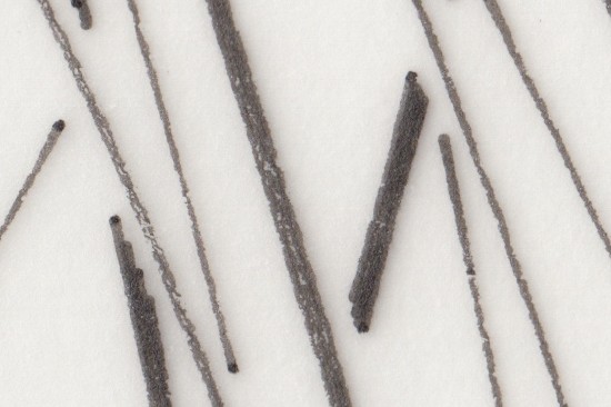
A pen’s self-sacrifice. And this is when I noticed that my trusty UniPin 0.1mm pigment marker was running out. To still squeeze out a last plot before buying a new pen the next day, I dialed the drawing speed down, turned off acceleration, and plotted the whole drawing twice for reinforcement. And the next day, when I made a print with this template… My crisp whites were back!
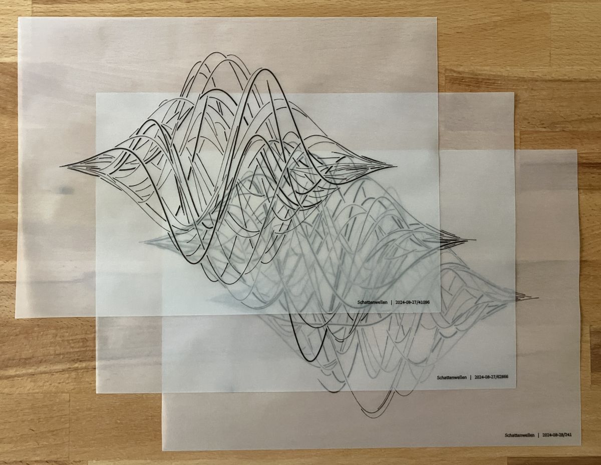
It turns out solid blacks on the tracing paper are really important for good blueprints. I made a high-res scan of a good plot and a bad plot. The difference is not immediately visible to the naked eye, unless you actively look for it against a crisp backlight.
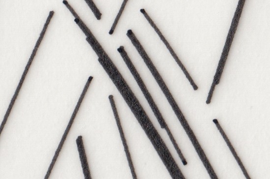
After switching to a new pen two days later, and plotting everything twice at slow, constant speed, my bleeding issue in the blueprint was happily sorted.
Let’s coat frugally! Now that the whites are white, what if instead of drenching the paper I brushed on barely enough of the photosensitive mixture? With the ceiling light on I could work thoroughly to avoid dry patches, but still brush on no extra liquid that could pool on the surface.
The papers had a nice even color in the evening, and as I rinsed the first prints the next day it was obvious… with this last tweak I had nailed it!
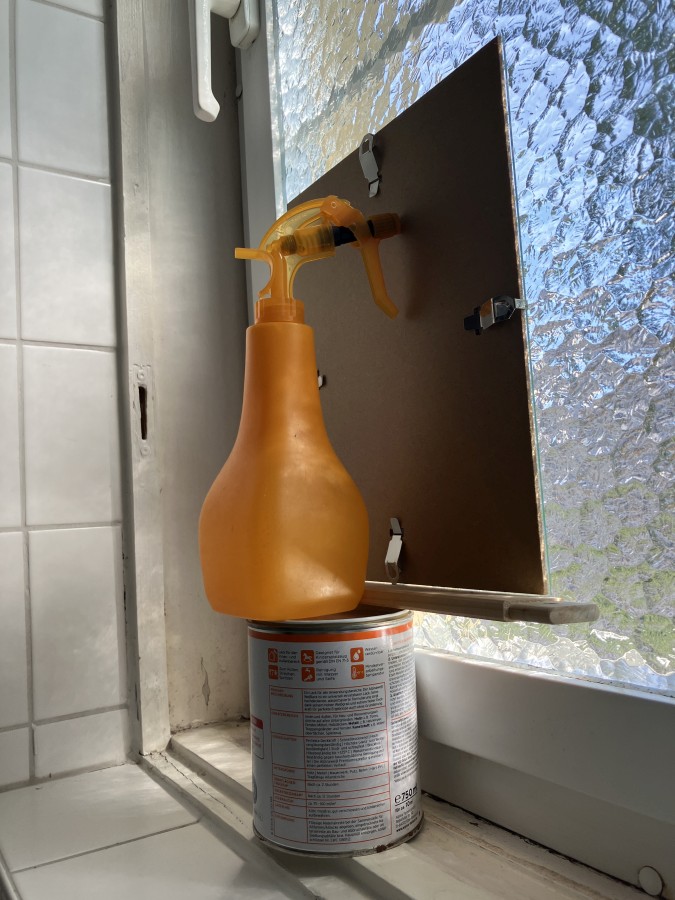
The fortuitous bathroom window. When I noticed that I was borking my paper I started to just make raw prints with no tracing paper to test the outcome. I didn’t bother to go donwstairs and outside for direct sunlight; I improvised this contraption in front of my textured glass bathroom window instead:
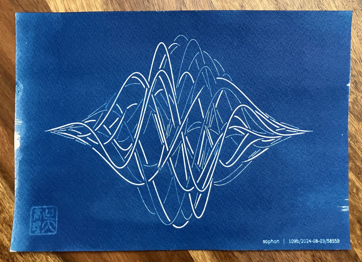
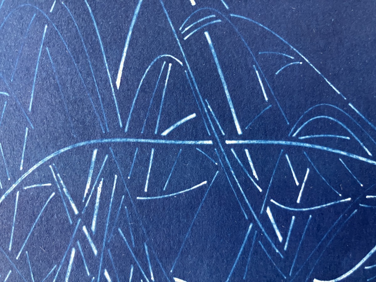
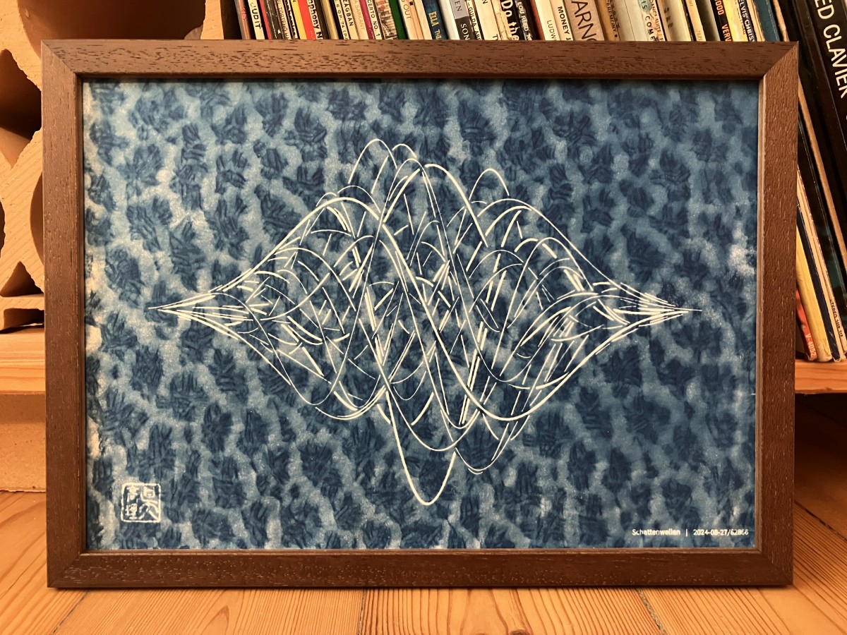
When I rinsed the paper from this setup I discovered what a great pattern the caustics create on the blueprint. You can see it on the final Schattenwellen prints.
This’n’that
A few miscellaneous thoughts and takeaways for the end:
- Tracing paper is weird. It feels plasticky to the touch, but it absorbs water readily, and it tears easily when wet. Most kinds of ink bleed on it because of this; I tried several pens before I found the UniPin pigment marker. Everything else produced fainter, thicker lines.
- As time passes, the blue of the prints becomes gradually deeper and richer. I’ve found that this process continues for several days after rinsing.
- Hanging the prints to drip and dry (as I showed in a photo earlier) looks very cool, but in practice it’s impractical. It’s better to soak up most of the water with kitchen paper, then let them dry on some flat surface.
- Would the prints work out better if I mixed the two solutions a few hours or a day in advance? But then the mixture would need to be kept really dark over a day… I wonder if anyone has actually tested this out.
- Most guides seem to recommend using distilled water instead of tap water, but their reasons about “chemical contamination” are not convincing. What does seem to matter is pH: alkaline water hurts cyanotypes, and tapwater in some places may have pH values above 7 (neutral). In any case, since I started running an air dehumidifier, all my distilled water needs have been solved, and that includes house plants as well as cyanotypes :)
- The chemicals used are not grossly toxic. In the quantities we’re talking about they are safe (and legal) to pour down the drain. It’s OK to use them in your kitchen; just rinse the sink and whatever utensils your are using with running water.
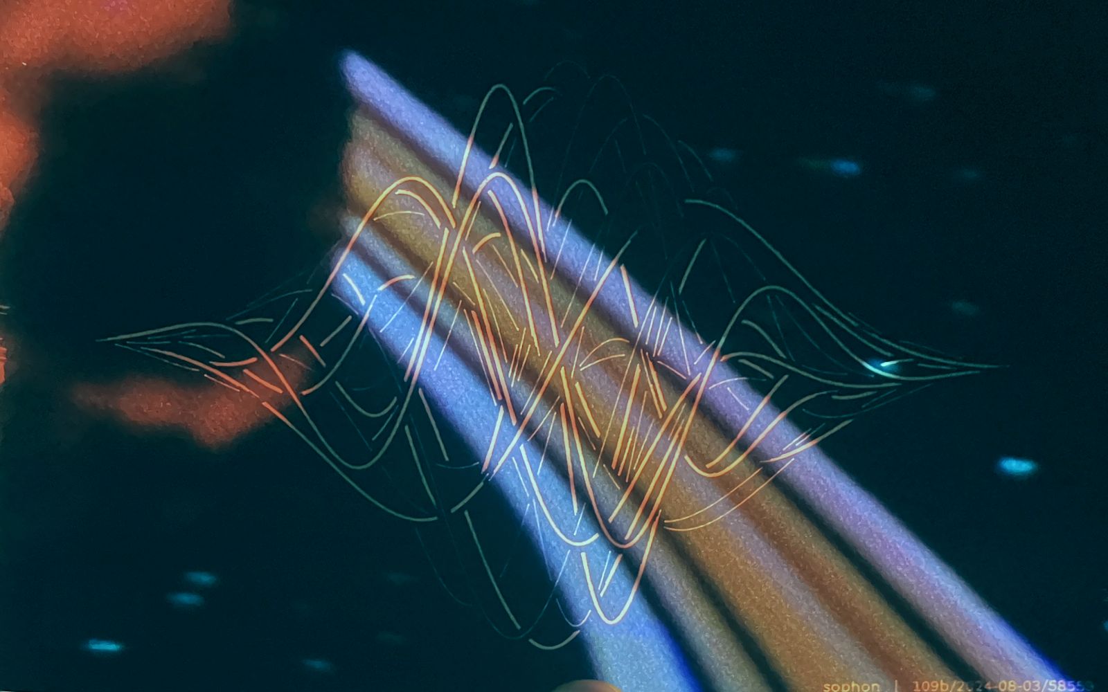
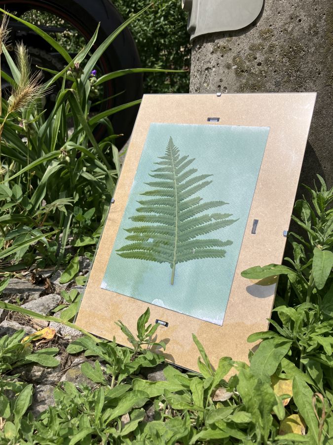
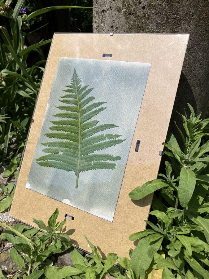
- Blueprints are amusingly difficult to photograph with smart cameras like your phone! A picture with so much blue messes with automatic white balance by itself. Add to it LED lighting with various color temperatures, and the outcome is entirely haphazard. Below are two photos of the same print. The light actually comes from my high CRI studio light. In the first photo it’s set to a warm temperature; in the second, it’s at 5700K.